Blog


Telling A Story

 
Telling A Story
12" x 9"
Oil on RayMar Canvas

It's not that I want to paint like Karin Jurick.... (well, okay, I'd like to paint as well as she does...) but last week when I was at the Norton Simon Museum with my local art club (see previous blog post) I saw so many images that made me think of Karin's work that I couldn't help myself. I was taking photos like mad and was especially entranced by the two daughters of art club members who were at the museum with us. Each girl's father is an awesome painter who has painted his own daughter many times in his own beautiful style, so I am hopefully not doing them a disservice by using their girls to capturing my own moment in time.

Although the girls did spend time looking at the paintings and listening to the guided tour, they finally tired and soon became more interested in a different kind of storytelling..... Not the story told by the art... Not the story told by the group's leader, but the story in the book.

I painted this using a combination of several reference photos and really did think I captured the "story" of these beautiful children at the museum.

TAGGED AGAIN
A week or so again I found that I have been tagged again by a wonderful artist named Maggie Mayer. I was quite surprised as I didn't know she even knew about my blog but of course very flattered to be mentioned. The last two times I was tagged I listed things about my wedding in Venice among my "unknown" facts. Not sure what I should list now.... Here goes:
1. My dog, Rocky, sometimes sits near my feet under the table when I use the computer... All fine and good unless he's eaten something that doesn't agree with him... He can clear a room in no time at all.
2. I am blessed with a husband who enjoys cooking. It's his art and he's a true master. It is always a struggle, however, not to consume every crumb he cooks.... And getting harder and harder as the years go by.
3. I went back to school to learn Italian after I had decided to marry Gastone. Took several courses at UCLA and proudly flew back to Italy to get married. Everything went well when they were talking to me, but I found I was totally unprepared to join in when the family spoke to each other.... They spoke Venetian dialect... NOT Italian.
4. When my husband moved to Australia with his family when he was 8 years old, the kind teachers sat him next the the only other Italian student in the class... thinking she would help him out since he didn't speak English. The only trouble was... SHE didn't speak Italian. She spoke Sicilian. Although Gastone spoke both Venetian dialect and Italian, she only spoke her dialect. In Italy, these dialects, are disappearing because in schools ITALIAN is taught, but at one time they were really languages of their own.
5. My first real computer was a Franklin. (Have you ever heard of it?) I think it was 64 K... but I don't really remember. It had no hard drive --only a floppy, so if you were writing a lot... like lesson plans, etc. and didn't save everything before you filled up the floppy, you were S.O.L. I took a class to learn how to program BASIC. (HA)
6. Both of my parents were college graduates (from Oklahoma University). I got my BA (in zoology) from UCSB, and my MS (in education) and teaching credential from USC and my administrative credential from Pepperdine (when it was on 79th in LA... not the beautiful campus it has now in Malibu.)
7. My fifth-great-uncle was Davy Crockett. (Man, I was a big hit in my coonskin hat back when Disney had Fess Parker playing Davy on TV.)

Now for the artists and other bloggers that I can tag back: Elizabeth Pearson, Loriann Signori, Leslie Saeta, Holly Bedrosian, Elizabeth Louros, John Paul Thornton, Dar Presto, and Janelle Goodwin.

Now they can do what they like with the TAG. Do the 7 "all about me" things and tag 7 others or just move on. But it has been fun following their blogs, all the same.
Read Full Post


A Tour Of The Museum With Friends - Vermeer - A Special Treat

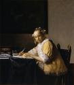
The monthly meeting of one of my local art groups, The Valley Artists Guild, was on Sunday. The group had decided to meet at the Norton Simon Museum which is one of my favorite museums here, not too far from my home. The occasion was a special exchange of paintings between museums which allowed Vermeer's "Young Woman Seated..." to be seen here on the west coast. Vermeer is most well loved for his use of and ability to beautifully paint natural light.
"Vermeer worked slowly and with great care, using bright colours, sometimes expensive pigments, with a preference for cornflower blue. He is particularly renowned for his masterly treatment and use of light in his work. What strikes in most of his paintings is a certain love, which easily could be called a love sickness, for the people and the objects in his paintings. He created a world more perfect than any he had witnessed.

After having been virtually forgotten for nearly one hundred years, Vermeer was rediscovered in 1866 when the art critic
Thoré Bürger published an essay attributing 66 pictures to him (only 35 paintings are firmly attributed to him today). Since that time Vermeer's reputation has grown, and he is now acknowledged as one of the greatest painters of the Dutch Golden Age.

Vermeer produced transparent colours by applying paint to the canvas in loosely granular layers, a technique called
pointillé (not to be confused with pointillism). No drawings have been positively attributed to Vermeer, and his paintings offer few clues to preparatory methods. David Hockney, among other historians and advocates of the Hockney-Falco thesis, has speculated that Vermeer used a camera obscura to achieve precise positioning in his compositions, and this view seems to be supported by certain light and perspective effects which would result from the use of such lenses and not the naked eye alone. The extent of Vermeer's dependence upon the camera obscura is disputed by historians.

There is no other seventeenth century artist who early in his career employed, in the most lavish way, the exorbitantly expensive pigment
lapis lazuli, or natural ultramarine. Vermeer not only used this in elements that are naturally of this colour; the earth colours umber and ochre should be understood as warm light within a painting's strongly-lit interior, which reflects its multiple colours onto the wall.

This working method most probably was inspired by Vermeer’s understanding of
Leonardo’s observations that the surface of every object partakes of the colour of the adjacent object.[ This means that no object is ever seen entirely in its natural colour." ..(from Wikipedia)

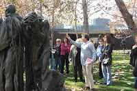
The club members met in front and were led through the museum by our President, John Paul Thornton, who thoroughly entertained and educated us with an on-going discourse about the various paintings, the history behind the times and the artists. He started in the sculpture garden with a description of Rodin's "Burgers of Calais" which I had seen many times, but didn't know much about. John Paul's story was passionate ... you can probably see that from the way he uses his hands as he talks. I was fascinated. I have always enjoyed listening to John Paul who seems to totally enjoy sharing his wide variety of stories and interesting facts, but also learned from him. He has an amazing command of art history (and ... I think he must have some Irish heritage.... a bit of the blarney in him). I met old friends and some new people as we went through the various halls of the museum.

John Paul was my first art teacher. I started out at Mission Renaissance because although I had never done any drawing or painting, I thought it might be fun and it was close by my home. I was totally involved in work and family... ... actually since I was a school principal... it was mostly work........ I thought I should broaden my interests a bit. It was always fun to come to class each week and learn from John Paul, hear his stories and try new things. I think he was my teacher each Monday night for about six or seven years. The school was
wonderful and John Paul was and is the best. I will always value the gift he shared with all of his students. Who knew it would be so important to me now. -- As students passed from one stage to the next (drawing, "tone drawing", tone painting, color, etc.) , they begin to "copy" various masters. Here is my version of one of Vermeer's masterpieces. I did it about five or six years ago and my Dad liked it so much he's got it up in his house.

Do you think it would pass muster as a forgery?? Maybe I could sell it for big bucks!!! (Tee Hee).

Read Full Post


Creating a Story in Portraiture

I've been following several blogs such as Silvina Day's, Jala Pfaff's and Joan Breckwoldt's and the comments readers have made about figurative paintings related to the vision or message involved in creating a portrait. Opinions differ greatly but in general I think those of us who create our figurative studies in class are limited by the pose which is set up by the teacher or the model...... (and also by whether we, as the painter, happen to get into class in time to set up in a "good" spot.)

After reading Leffel's book and reading the various thoughts in cyberspace, I've tried to think of a story I want to convey when I paint a portrait or do a figurative study--- or in reality -- anything else I paint. In the last class of Johanna Spinks' LAAFA session, our model was a beautiful girl named Stevie. Of course I had come prepared to paint a guy, so was amused when I saw this Stevie. However, she was a delight. She came in an outfit that she had created and dyed herself and she passed the time between sittings by knitting. She also was kind enough to allow photos (for a small fee). I appreciate this because not all models do allow photos even for a fee and sometimes I actually LIKE what I do in class, but rarely can finish in a three hour period.

Unfortunately, although I THOUGHT I was starting out fine, my class portrait of Stevie began to take on the appearance of Frankenstein's monster. I had toned my canvas with a reddish orange wash... Initially I thought that would be great because so much of her outfit was orange... however, her eyes and uncovered canvas seemed to glow werewolf or vampire red through the covered canvas and I had been hasty with my initial sketch so my proportions were off creating a too large and squarish head. EGAD! Disaster followed my initial pleasure in devising a "story" behind the portrait.... It became the stuff of Mary Shelley - definitely NOT what I had been planning.

However, I really liked Stevie's look so I took the painting and the photos home. I repainted the study from class...... (see Stevie on the left.) It's better but doesn't convey what I wanted to convey. Johanna had wanted to see Stevie's really lovely eyes, but somehow it didn't seem right to be looking up from her knitting. So I did another from one of the photos I took of Stevie during the break. I really enjoyed the comfortable, content and intent feeling in this pose. The larger top painting on the right is my story .... Stevie on a break. I really like it!

Read Full Post


Marian's work will be shown at the North Valley Art League 25th Annual National Show

Whew... That's quite a title for a show, isn't it? What caught my eye when I saw it on the CAC website was the fact that it is a NATIONAL show. I thought... why not try??

This is what the NVAL says about its show:
"North Valley Art League is proud of its long-standing Annual Juried National Show, where League members compete with known and up-coming artists from all over the United States. Few cities the size of Redding can attest to a show of this importance. A nationally-recognized artist is invited each year to select and jury the works and present a week-long workshop. North Valley Art League's Annual National Juried Show brings together local and national artists in an exhibit that has been called one of the North State's best. Those who make the final cut may be assured that they are among some of the finest in the nation, making this our most anticipated competition by artists and viewers alike. The reception coincides with the Annual Redding Cultural Cruise. Visitors to the Gallery on this chilly January evening are met with a warm atmosphere, chamber music, fine food and beautiful art that become the counterpoints for lively conversation with other artists and art lovers alike."

The Juror for this show was Birgit O'Connor who is a watercolor artist specializing in florals and landscapes. Birgit finds watercolor the most fluid and expressive medium and sees her paintings as reflective of nature's voice.

I had TWO paintings juried in to this national show. Both are landscapes and both are oils. Incidently - both are for sale.


I am very proud to have been juried in to another national show. The first national show I was juried in to was at the Palm Springs Art Museum in January of 2007. Since then, I've learned many things about shows and the jurying process, but it's still a thrill to be accepted. I have not yet decided whether I will be able to travel up to Redding for the reception, (when I entered, I had misread Redding as Redlands... silly me) but just in case you live nearby or know someone who does live nearby, here is the information about the show:

North Valley Art League
48 Quartz Hill Road
(Caldwell Park)
Redding, CA 96003

January 26, 2009 - February 28, 2009
Hours: Tuesday - Saturday 11:00 a.m. - 4:00 p.m.

Reception and Awards
Friday, January 30, 2009
5:00 p.m. - 8:00 p.m.

Read Full Post


On the Eve of the Inauguration............


Hope, Optimism and Determination are what I see on this evening before we celebrate our new President's first term.

I see it everywhere... It's on the faces and lips of the usual crowd who sits at Gelson's enjoying a bagel and a cuppa every morning.... even those who adamantly supported McCain. It's in those young Obama supporters like my son and his wife who are planning a get-together party for tomorrow night to celebrate together. I even see it on the TV news which is so often a downer. I believe we all face a mighty big challenge and I certainly don't envy Obama his daunting new job... but with hope, optimism and determination all of us together can help make our nation and the economy strong once more.

Karin Jurick's "Different Strokes From Different Folks" (DSFDF) Challenge was to paint the Jefferson Memorial. It's my first "night painting" and I found that taking the photo of the painting was almost worse than trying to paint the scene. I decided to use a sky I often see from my front door as the background just to make it a bit different. Hopefully Jefferson as well as Lincoln, King and others who have made a mark in our beautiful Capitol would approve. This was a fitting challenge for today and for the future. Thanks, Karin!

Read Full Post


Day Two .. Painting in Paradise With Ray Roberts

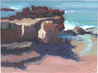
High Tide Rocks
I feel that I am very, very lucky to be able to learn from wonderful painters such as Ray Roberts AND to live in and travel to beautiful spots. But to me, the world is beautiful just about anywhere, so that's it. I'd love to be able to paint wherever I see beauty and share a bit of it by painting it well.
Low Tide Rocks


Day two in Ray's workshop started at Heisler's Park where we painted yesterday. I was amazed to see how different the SAME ROCK WE PAINTED yesterday had changed. The tide was high - very high! Apparently the moon, which was full and beautiful last night, is the closest to the earth as it has been in 16 or 20 years! (Tyler, my 8-year-old grandson, informed me that it was the biggest it's ever been in the universe!) So the scene, which was the same, was different.. still gorgeous, but different.

Many in the class were already painting away when I got there at 9:00. Although it was the appointed time, I felt like a slacker and wondered about whether some of the jokes from classmates yesterday about meeting a dawn weren't really jokes. No worries.. I just broke out my gear and got started as Ray said he wanted us to paint and that his demo would be after lunch. Yesterday I had kicked myself because when I broke out my gear I had discovered that I'd left my portable easel at home. As it turned out, since I was working on small formats (8 x 10), it was just fine to work on my lap. In fact it was better in the afternoons as the Santanas kicked up. Everyone else was fighting the wind... It didn't blow anything I had down. A mistake that turned to a blessing in disguise.


Some "Rayisms" from day two .....
Put in the dark shapes early because they are most likely to change rapidly
Darks are the composition
It's not the color you see... It's the way it relates to every other color in the whole painting
Ray never paints with tube black OR earth tones..... He mixes them
There is no information in the shadows.... It is not needed to get form
A caste shadow has sharp edges closest to the object that is casting it and it becomes more diffuse as it gets farther from the object
Light is warm so faces of a cliff facing down are reflected warmer and those facing up reflect the sky
#1
Keep crisp edges on shadow shapes
Look up the work of Frank Brangwyn who would "key up" sections of his paintings to create luminous effects
Look at William Ritchel's overlapping shapes and lighting
Values do all of the work but color gets all of the credit
Everything in shadow is darker than anything in light

Ray demonstrated a "high key" painting where the darkest dark wasn't very dark and the values were all close together. He emphasized temperature changes to depict form within a shape. He used lovely unusual colors.

I worked on three studies on day 2. (Two 8x10s and one 6x8) I liked my first one the best and my last one the least. Here are some comments made during the critique session:
#2
#1 (The Rock With a Wave)
Good but do something to make the section of wave on the bottom left look less spotty.

#2 (Something Different) Finish the foreground grasses etc. .... or crop it out. Good horizon line. Be careful that the three waves are too much alike.
#3 (above... which I thought was a big mess) (The Rock at Low Tide) Good Values. Foreground rock formations are too similar... change the color and shape to make them different. Lower the value of the bright rock on the left. It is not quite as bright as the light shape on the right.
I was sorry to have to leave. Many thanks to Ray. I hope that some of you in blogland may be able to enjoy his workshop in the near future!

Read Full Post


Ray Roberts Workshop - Day One


The weekend started off on a high note. My family went with me to the "New Beginnings" reception at the Burbank Creative Arts Center where I was so happy to see that both of my paintings were featured in the first spot you see when you walk in the door! They looked great there... It made me smile! It was fun seeing and chatting with so many of my artist friends. My family and I had to leave a bit early so we could drive down to Laguna Beach but I left feeling very pleased!

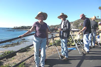
We met at Ray's gallery the next morning at 8:30 where Ray introduced us all and talked a bit about the equipment he uses, the supports he paints on, and the expectations for the next two days. One of the people in my workshop, Steve Wilson, looked familiar and we realized that we had taken the same Brian Blood workshop last October up in Monterey. What a small world it is!

Ray uses interesting painting supports for many of his studies which I will investigate further. One type is a canvas paper panel using Milano cotton paper... very thin and light... which he gets from Windriver. (Since I have so many paintings all over, this flat aspect would save lots of space!)

Southern California outdid herself this weekend giving us clear sunny warm weather. Laguna Beach was as gorgeous as it gets and provided the perfect backdrop to a terrific two day workshop with Ray Roberts.

Ray and his wife, Peggi Kroll
, recently opened a gallery featuring a joyous display of paintings in their own unique styles. It's in a terrific location, two doors up from the Laguna Art Museum, and if the flagging economy doesn't make it too difficult to go on, I'm sure it will be a success. They will be doing workshops like the one I took this weekend monthly, so if you get the chance..... check out their website and go for it.

I found Ray's painting outlook most refreshing. Of course he paints outdoors a lot. But his intent for this work is to study light and pattern and color. He uses these studies along with lots and lots of photos to design a composition with which he will create his studio work. He said to "think in black and white and to paint in color." He has a beautiful monitor mounted on his wall... It's got to be over 17" -- and after he has designed his compositions using his photos that he has edited, he'll display the image on the monitor and use it along with the color studies to create his finished work.


Ray's first demo of Day 1. (He did two that day.)


Don't ask me why but that really freed me up. I went out to do color studies -- not to paint a scene. Roberts uses a lot of information which he has learned over the years and which he credits to others - giving examples from the video monitor of Robert Moore's work who paints beautifully although he is color blind. As Ray Roberts said over and over... If you have the VALUES in correctly the colors don't matter. When dealing with color Ray said he learned from John Asaro at the Art Center in Pasadena that you need to analyse WHY a subject is the color it is. Is the color a reflection from the sky? .. from the water? .. from the rocks?... He likes to use warm colors and says that cool colors can be "deadly". (Something I totally agree with.)

This workshop focused on painting rocks and water and much of his advice related to that theme. Although Ray would have preferred weather with "more atmosphere" to me, it was really beautiful. We spent the day painting rocks and the sea.... ABSOLUTELY GLORIOUS!!!

Some other advice:
Avoid equal shapes or colors or equal ANYTHING
Look for extremes in everything
Key Up (Make all values lighter)
Reds and yellows are "darker" than you think, so you need to be careful when using them
Look for the reflections (of rocks) in the face (not the white water) of the wave
Look for those little miracles of vision and light
Light reflects darker
Darks reflect lighter
Really dark color won't reflect at all
Look at other artists' work... look at zillions of photos... Read Edgar Payne's book
Squint
Keep most whites warm.... (Although he likes to use pure white as well)
Make CRISP edges on your dark rock shapes
Organize your shapes so that they are compositionally interesting
It's all about pattern
Foam (on the water) isn't quite as white as the sun glistening on the water
It's not the color you see... It's the way it relates to every other color in the painting
"2/3, 1/3, and a little bit" (A compositional tool to try out)
Drawing is critical and should be learned so well that you don't have to work at it

Here are my two 8" x 10" studies from day 1. Ray gave advice throughout the teaching sessions, which I tried to apply. (I was pleased that he thought my values were good as I was working.) I see however, from posting this here, that this first one could have been a LOT higher in value. .. oh well. There was a critique session at the end of the second day and I'll repeat his suggestions for these:

#1 (The Rock .. tide's going out) Make the white ripples less spotty on the right and lighten up the background ocean value a bit... otherwise good job.

#2 (Sparkles)The two background rocks are too much the same. Change the value of both but change the shape of one. Otherwise successful.

It was a wonderful day in SoCal.

I walked about 4 miles back to the hotel, then rested up and cleaned up. Our daughter and her husband drove up from San Diego to meet Gastone, Tyler and I for dinner. I love being with my family!

Read Full Post


Four Cuties

Four Cuties
6" x 8"
Oil on RayMar Board

I love small format paintings!

I have been intrigued with the various artists in blogdom who do small format paintings. Some do still lifes and studies and some do large scenes in miniature. So far I haven't done many, but of those I've attempted I've found more success with painting smaller still life type set-ups. One of my painting goals is to do more small format paintings.

The fact that they are small seems to erase the anxiety of working hours and hours on something ... faced with the possible disappointment of not having it turn out the way I envisioned it when I started. The small format paintings allow me to plan, paint and see the result in a relatively short amount of time. Sort of like... almost instant gratification.

I like many styles of realistic painting ... from loose and juicy to tightly rendered with lovely brushwork. One of the small format painters I've come to enjoy is Michael Naples whose work is tightly rendered, but whose brushwork sings. I even purchased his little painting of his little girl's Mary Jane shoes to drool over in person. (Now I've given it to my daughter-in-law to enjoy..... I hope she likes it as much as I did.) I also bought a little painting (a surfer which I gave to my son-in-law) from Laura Wambsgans, who paints larger scenes in many formats including these small formats.

They both paint on boards without canvas. I tried the little board that Laura uses and found it much too slippery for my taste. I just couldn't get the paint to grab the way I like it, although she manages to do lovely juicy work using this support. When I asked Michael about it, he said he starts his paintings by painting over the board with black acrylic paint.

I decided to use a canvas board and paint it with black acrylic. That little board had been sitting there on my desk for several days "looking expectantly" at me while I searched for what I wanted to paint. Then my husband brought home a bag of tangerines!! Perfect!

What fun I had last night painting these "Cuties"!

I had painted all day in Johanna's portrait class. The model was Sara Streeter who has been on some "Nip and Tuck" signage... Nice lady. I'd done okay .... had fun .... hadn't created a disastrous painting .... but although it was okay it didn't speak to me. Maybe it's just "okay" because -- like what Silvina was talking about in her recent blog -- I didn't have a concept that I was trying to achieve.

I wanted to paint something that could make me smile. I laid out those little tangerines until I saw a combination I liked. When I put them on my black chair, there was a great muted reflection that I thought looked nice. "Four Cuties" is the result. (I just looked at Michael's site and he just painted some WONDERFUL tangerines... much more finely rendered and painted than mine, but I like mine anyway. ) Whatcha think?? (Of course if anyone would like to have these "Four Cuties" for their very own, just email me an offer.)

I'm off to the opening of "New Beginnings" tonight then to Laguna for a weekend of painting in a workshop with Ray Roberts. Yippee!! Hope your weekend is great too.

Read Full Post


New Beginnings Exhibition

HAPPY 2009!

"NEW BEGINNINGS"


I just wanted to let you know that there is a new SFVAC show opening this coming Friday at a wonderful gallery in Burbank. It is called the Creative Arts Center Gallery and its quite lovely with lots of light and space to display the paintings in the exhibition. Luckily, I have two new pieces which were juried in to the show. They are both from a recent trip to the beautiful Monterey coast and I was pleased with the way they turned out.... (also happy to have them juried in to the show.) They are both for sale.


The juror was Robert Tanenbaum, a certified member of the American Portrait Society, and an artist member of the California Art Club.


"New Beginnings"
City Of Burbank Creative Arts Center Gallery
January 9, 2009 - January 29, 2009
Reception: 1/9/2009 - 7:00 p.m. - 9:00 p.m.
Hours: M-Th 9:00 a.m. - 8:00 p.m.
Fr 9:00 a.m. - 5:00 p.m.
Sat 9:00 a.m. - 1:00 p.m.
Closed Sunday


I'm driving down to paint in the Laguna area this coming weekend, but I'll try to be at the reception during the first hour or so on Friday night. If you live anywhere near Burbank and have a chance to drop by the gallery, please come on by.

I hope 2009 proves to be one of your best years yet.

Read Full Post


Painting Carmel Mission


Morning at the Mission
18" x 14"
Oil on canvas

Sharon and I visited Mission San Carlos Borromeo de Carmelo, which is better know as the Carmel Mission, early one morning on our way to paint out on the Monterey coast last July. The Mission is located near the Monterey Presidio beside the Bay of Monterey and was founded in 1771. It is a busy place - part of an active school with parents and staff moving about with a purpose. It looked like they were getting ready to have a white elephant sale of some kind and the parking lot was full. We had just enough time to snap some pictures (being careful not to step on the cactus and other vegetation near the wall I was leaning against) and move on.

It was a gorgeous day and all of us in Brian Blood's workshop enjoyed the beautiful crisp weather and spectacular views, but the memory of the mission lingered. This is my impression.

The nearby city of Carmel by the Sea also has special memories. My husband and I used to visit every summer during August near the date of our anniversary when there are several wonderful car events. There is a Ferrari show... which is, of course, something every red-blooded Italian man MUST see. Even I was quite impressed. There is the Laguna Seca race which features vintage race cars going round and round... (fun), and most impressive is the Concourse d'Elegance... This is a display of extremely beautiful and not often seen carefully restored and maintained vintage cars out on the Pebble Beach Golf Course Coast... This is a beautiful backdrop for fabulous cars, lots of people with money and even some well-known car buffs who are familiar faces on TV and movies. We used to go with a group of friends, but stopped going when the tickets to the Concourse exceeded $150 per person. Oh well... Good memories all the same. Maybe you'd enjoy going some summer!

Read Full Post


Lulu's Christmas Toy


Lulu's Christmas Toy
9" x 12"
Oil on RayMar Panel

I've never painted a pet portrait before. I've wanted to for a long time because I have a girlfriend whose cat died and I thought she might like to have a painting of him. But when I asked her for a photo of her cat pal, Nick-At-Night, the photo didn't do much for me so I never really did anything with it. But it's always been at the back of my mind.

Since I've been surfing around enjoying wonderful artist's blogs, I've seen some great pet portraits and it sort of rekindled my desire to paint someone's beloved animal. I could always paint my Rocky... (He's a sort of scary looking white pit bull who is so wussy and lovable that once you get past his initial looks, you'd never believe he was a pit bull at all.)

Well, over Christmas my daughter, Francesca, and her husband, Greg, came up with their HUGE and lively new young dog. Lulu's not actually a puppy anymore.... She acts like one and she weighs over 75 pounds now and is always in motion... except when she's asleep. Her tail is deadly but she's endearing and smart and... yes... she's cute. My Rocky is ten or eleven years old. Lulu is almost one year. Rocky loves to play, but Lulu did try his patience and more than once he told her in his own scary pit bull way to KNOCK IT OFF!

Both dogs got presents for Christmas. (Somehow Santa knew!!) Lulu's gift was a stretchy and squeaky monkey which she would bite and toss around. Bite, squeak, bite, squeak.. run a bit... rest a bit... bite, squeak. Okay, Lulu... knock it off!

I decided to paint her. I think my daughter will like the portrait. I thought about titling it "Lulu's First Christmas", but decided against it. I had fun adding colors in to Lulu's shiny black fur... and I think it looks like her.

Read Full Post


Goal Setting


Monterey Magic
16" x 20"
Oil on canvas

  • Well, the new year is here and so many artists I admire (See Linda Blondheim and Karen Winters as examples.) have been posting the goals they set for themselves. They put it all out there so that everyone can see and so that they can check back at the end of the year to see if they met the goals. This is a sort of gutsy strategy because, after all -- one doesn't want to fail -- especially in front of others.

    Then there is the actual choosing of goals. Goals must be selected that allow you to stretch but that do not cause you to destroy yourself in the trying. They should be realistic and not pie in the sky.... (Like... "I want to make a living with my art THIS YEAR!") After all... I paint for enjoyment... don't want to make myself depressed so I CAN'T enjoy it. So... how to choose reasonable and challenging goals for ME....

    Here goes:
  • Continue taking classes and workshops from artists I admire.
  • Continue working to increase my ability to see and create accurate value patterns in my work.
  • Learn to loosen up my brushwork without being messy AND to make the work tighter... (Is that possible?) Figure it out.
  • Create more small format paintings.
  • Paint en plein air AT LEAST once monthly.
  • Continue developing the blogs.
  • Send my work into TEN juried shows that are not local.
  • Sketch and draw at least three times a week. (My previous post about the sketchbook project did NOT result in daily sketching.... :(.... too lofty.)
  • Market the work that gets accepted into shows... especially those that are not local.
  • Develop a body of work that is ready to be shown in a one person or small group show.
  • Exhibit my work in one gallery or one person venue.
  • Accept and complete at least one commission.
  • Sell 50% more paintings than in 2008.

WHEW!! Those are pretty lofty goals for me. Wish me luck!!

And most important... Help me remember that although I want to continue to grow along this painting journey... It is the journey itself and the family I'm in that sustain me.

Have a happy, healthy and prosperous 2009!

Read Full Post


Topics

Archives