Blog


Not With A Brush -- With A Mind And A Heart

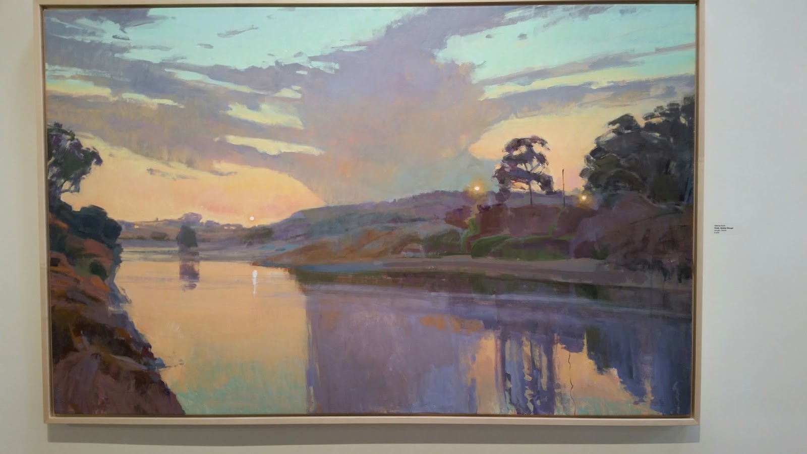
Near where my daughter lives is the most beautiful place to paint -- the Goleta Slough.
Just south of the UCSB campus this lovely beach is constantly changing with the tides.

*************************

Before Christmas I signed up for a Mentor Monday session through the California Art Club.  The artist who was to critique our work was Marcia Burtt - a wonderful acrylic artist with a very loose style, excellent creative designs and amazing color sense.  I have long admired her work, but never met her.  She was delightful and I thoroughly enjoyed my morning.  She spent time with all of us in the session discussing what might make our work stronger.  Before the session was over she mentioned that she would be hosting a workshop with Ray Roberts in early February at her studio/gallery in Santa Barbara.  As you may remember, I love Ray Roberts' work and have studied with him previously.  Since my daughter lives in Santa Barbara, I wouldn't have to pay hotel bills so I decided to sign up.


From Marcia Burtt's Studio/Gallery

I really enjoyed the excuse to spend more time with my daughter and grandkids while I was up there.  That was the bonus.  The workshop was the excuse.

I had a great time in the workshop and learned a lot from both Marcia and from Ray.  Marcia had a large canvas which she quickly covered with her beautiful acrylic colors.  She is more interested in on-the-spot gestural work.  Ray emphasized the importance of creating many small studies in the field and using them in addition to photographs and videos of the scene to create larger studio work.  We spent two days in the field during absolutely gorgeous weather, as we watched demonstrations and created our own small studies.  I did little 7 studies -- none worth sharing except to tell you of the enjoyment of being outside and painting in a beautiful spot. 

From Marcia Burtt's Studio/Gallery


While in the studio part of the session, Ray discussed how he uses captures from videos (he had flown a drone around the slough and had some amazing video) as well as photos which he manipulates in Photoshop to use as a basis for his studio pieces.  He showed us how he can enhance the "sparkles" of the sun shining on the water or manipulate the colors.  It was all very interesting and we each practiced with our own computers to see if we could do it as well.  (I'm going to have to practice the "sparkle" bit...  Didn't quite "get" it yet.)


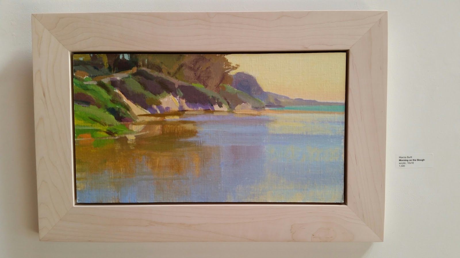
During that last day in Marcia's studio/gallery I started the painting above.   Everyone in the class spread out.   Some were behind Ray to better see how he was handling his computer manipulation and his own painting and others, like me were off to the side.  Ray wasn't happy with his start -- almost wiping it down.  He realized the next morning that he had made the value of the water too light so he set about fixing it.  (Nice to know even the greats can get off to a bad start.)   It was interesting to see what all of the other artists created also.  Each of us had a unique take on the workshop and place where we were painting.   Basically, while there, I worked on the scene using Photoshop Elements and blocked in the painting.


At home over the last few weeks I've completed the block in and spent a lot of time refining it.  Sometimes I wonder if the time it takes to finish a painting is spent more with a brush in hand or through hours of thought, dreams and feelings of the heart.  I'm beginning to feel it's the latter.


I think it's very true that as artists, we are the sum of all those from whom we have learned.  We will always be our own selves but we take a bit of knowledge or a whisper of beauty from every painting and artist we admire.


I thought I was finished several times, but as the painting sat on my TV ledge in "time out", I would see something that I didn't like or that could be done better.   My mentor, David Gallup, is always asking us WHY we are painting something.  He tells us not to paint THINGS....  we should express feelings or what the scene says to us rather than just a place. 


That may be the most difficult task of all.

Many thanks to Marcia, Ray and David.... and to all of the other artists who have served as models and teachers along my painting journey. 

Read Full Post


Ray Roberts Workshop In The Studio


Although I've taken a workshop with Ray Roberts before and enjoyed it thoroughly, the main reason I wanted to participate in this workshop was because I wanted to see how Ray moves from plein air studies into studio pieces.  

Half of the third day and the entire fourth day were dedicated to studio work. By the end of the second day I was really concerned because I had painted NOTHING I wanted to consider turning into a studio piece!
Even so, I still found Ray's information interesting and I learned from him.

 Ray discussed the various plein air pieces he had created during this workshop and decided to use one of the sketches he had created of the rocky part of Eaton Canyon looking towards the mountains.  He said he would be using the patterns and colors he had interpreted from painting outdoors.  


We were fortunate to have a beautiful monitor in the studio we used on day three.  Ray uses a monitor to display photos and manipulates them using Photoshop.  (It was suggested that we use Photoshop or Photoshop Elements or a similar program for our own work.)  Since I wanted it anyway, I purchased Photoshop Elements and was hoping to see how Ray used it in his work.   Ray says his monitor is nice, but nowhere near as big as the one we used in THIS studio.   This huge monitor was GREAT for all eighteen of us to see, however.


Ray talked about the things he liked about the photo and demonstrated a few ways to cut and move elements of the photo around.  He also talked about and demonstrated how to simplify an area which was too busy in the photo. He used the artistic watercolor element to simplify the overall look.  He said that cropping a scene can change the composition. 


He then began to sketch the scene he had decided upon and block in the dark shadow masses.   (See the photo on the left.)

Here are a few additional thoughts he expressed over the session:

  • You are always drawing.
  • Finesse a painting to its end by cutting back into things etc.
  • Always consider the size of the shapes and the delicacy of the contours ... Everything should be unequal but natural... controlled chaos.
  • He is more concerned about the movement in a painting than in a focal point.
  • "It's not what I do, but what I avoid doing."
  • Use sweeping gestures... Rhythm is when your eye isn't stopped by something static.
  • Everything in shadow is darker than anything in light.
  • Sometimes it's better to use a black and white photo than a color photo... Like Edgar Payne did.  That way you are working with values to create your composition rather than getting confused with color.
  • Use overlapping shapes and avoid kissing edges.
  • He uses several different photos to create a final studio piece.  
  • Eventually you develop a level of taste when deciding what to leave in and what to leave out.  When in doubt, take it out.
Enchantment by Joseph Kleitsch
On the last day, since I had no desire to use any of my plein air paintings, (I had done 4 total Frisbees) I decided use my time and practice a bit with my Photoshop Elements and some photos I had taken from a hike back to Eaton Canyon Falls.   I used several different photos and took elements I liked from each to create a composition that I thought might work.  

I had seen a painting I liked at the Irvine Museum last year.  It was by an artist named Joseph Kleitsch called "Enchantment".  When I saw it, I thought of the Eaton Canyon Falls and had begun to envision this painting.  So this was a great time to start experimenting with creating my own.


I've been working on this painting in the studio off and on for several weeks now... Looking at values and movement and paint texture/brushwork.   However, now that I've posted this, I see that I have more work to do on my on it...  The light doesn't seem to create the movement in my own like it does in Kleitsch's.   So... I will work on it some more. 

One thing I'll ask you though....   ..    If I ever finish it, which title do you prefer?

  1. Enchanted Eaton
  2. Eaton Enchantment
  3. ????
Thanks for visiting and hopefully for commenting!

Read Full Post


Ray Roberts Workshop Continues

Ray painted two demos on day one.   The second was really a tree portrait painted almost in silhouette against the bright grey sky.   Here are some points he made:
  • Every tree has its own contour. 
  • Paint groups of leaves rather than individual leaves and find the rhythm and unifying graphic sense to the groups.
  • You are orchestrating a gestural summary.
  • There needs to be a balance between unity and tension.
  • You should have mostly leaves or mostly sky... never 1/2 1/2.
  • THIS WAS A CONSTANT THEME..... Find the rhythm... all paintings are patterns of light and dark...  It's all "stuff" in the sunlight... not things.
  • Paint a few and indicate the rest.

On the second day we had hoped for clear skies but were disappointed.  So after a brief talk and some scouting around we each found a sycamore or other tree with a shape that pleased us and tried to paint.  Here are some notes from day two:
  • The eye goes to where there is the most contrast.
  • Be faithful to the light.
  • Outdoor light harmonizes the colors.
  • Ray says he's a tonalist in composition, but a colorist when he paints.
  • He likes leaf patterns that spiral around the trunk or branch.
  • Pay attention to patterns and rhythms.
  • Ray calls himself a "movement" kind of guy rather than a "focal point" kind of guy.
  • Incorporate the contrast in the scene to help the design of your painting.
 Because we feared more poor weather, we decided to paint in the studio on the morning of the third day rather than in the afternoon of the third day.  (Turned out to be a beautiful morning...)  But you never know with plein air... It is what it is.

In the afternoon we were back to Eaton Canyon to paint outside again.  We painted and then Ray did a demo of the canyon again -- this time emphasizing the beautiful colors of the setting sun on the San Gabriels.  
 I'll discuss some of Ray's tips about working in the studio (We were in the studio for 1/2 day on the third day and the whole fourth day.) in my next post.

Read Full Post


Ray Roberts Workshop - Day 1

I'm not sure why I've not blogged about this workshop.  I enjoyed it and I learned from it.  Ray is a wonderful man and a great artist.  I met nice people.

Probably, my reluctance is that I painting absolutely NOTHING worth posting.   So finally I'll share some noteworthy items from the workshop and I won't post anything I painted.   I've been doing a lot of thinking about this blog and my painting journey.  There is no doubt that I have improved and a lot of it has to do with posting all of the humiliating work I've done over the years.   However, more and more, I'm reluctant to post the losers.   (and there are LOTS of those).   Sometimes the ones I thought were good enough to post, after time (sort of like dead fish) begin to stink.

Ah well, perhaps that's also a sign of growth and not just a bit of vanity. 

On to the workshop...

The workshop was hosted by the California Art Club so we met at the headquarters in Pasadena on the first day.   Ray showed us some of his studies and explained his basic procedure for painting outdoors.  Then were were off to Eaton Canyon where we spent all of our outdoor time.  Unfortunately the weather was quite overcast and atmospheric so all of the work we did revolved around those constraints.

However, here were some of the insights from the first day:

  • Ray's outdoor studies are just that.  Done to help him remember color and values in a scene.  
  • He sketches in the basic composition first and then paints the darks in to establish the pattern of light and dark.  
  • He always works dark to light.
  • Everything is relative
  • He establishes atmospheric perspective by doing the foreground shadows first then greying down as he paints those shapes that are further back.
  • He designs with value.   since there were not many shadows he uses the dark/light pattern of the wash because it unified the scene.
  • He likes verticals.  Horizontals create walls.
  • The challenge was to create form when there were very few shadows.
  • He looks for a rhythm for the light and dark patterns.   Not too many equal sized shapes -- Not equidistant, etc.
  • He made shapes descriptive yet interesting.  He didn't necessarily paint what was there.
  • Shadows serve two purposes.   Everything in shadow is darker than anything in light.  
  • Every time you put a different value on your painting you are creating a pattern.  The pattern should have a pleasing rhythm.
  • Sunlight harmonizes everything.  
  • He doesn't paint the colors he sees... He resolves color.   When working in the studio he tries to stay close to the the original studies for color and value of the larger paintings.  Color relationships are most important in the field.
  • Always paint a little bit lighter or darker than you see within large areas of color.
  • Within a value area -- keep value the same as you add color.  If you change the value pattern you liked when your started out, your painting is likely to go downhill.
  • Quoting Asaro (one of his teachers from Art Center) "Whatever you do... just paint!"
(There was more... but that's enough from the first day.)

Read Full Post


Day Two .. Painting in Paradise With Ray Roberts

High Tide Rocks
I feel that I am very, very lucky to be able to learn from wonderful painters such as Ray Roberts AND to live in and travel to beautiful spots. But to me, the world is beautiful just about anywhere, so that's it. I'd love to be able to paint wherever I see beauty and share a bit of it by painting it well.
Low Tide Rocks


Day two in Ray's workshop started at Heisler's Park where we painted yesterday. I was amazed to see how different the SAME ROCK WE PAINTED yesterday had changed. The tide was high - very high! Apparently the moon, which was full and beautiful last night, is the closest to the earth as it has been in 16 or 20 years! (Tyler, my 8-year-old grandson, informed me that it was the biggest it's ever been in the universe!) So the scene, which was the same, was different.. still gorgeous, but different.

Many in the class were already painting away when I got there at 9:00. Although it was the appointed time, I felt like a slacker and wondered about whether some of the jokes from classmates yesterday about meeting a dawn weren't really jokes. No worries.. I just broke out my gear and got started as Ray said he wanted us to paint and that his demo would be after lunch. Yesterday I had kicked myself because when I broke out my gear I had discovered that I'd left my portable easel at home. As it turned out, since I was working on small formats (8 x 10), it was just fine to work on my lap. In fact it was better in the afternoons as the Santanas kicked up. Everyone else was fighting the wind... It didn't blow anything I had down. A mistake that turned to a blessing in disguise.


Some "Rayisms" from day two .....
Put in the dark shapes early because they are most likely to change rapidly
Darks are the composition
It's not the color you see... It's the way it relates to every other color in the whole painting
Ray never paints with tube black OR earth tones..... He mixes them
There is no information in the shadows.... It is not needed to get form
A caste shadow has sharp edges closest to the object that is casting it and it becomes more diffuse as it gets farther from the object
Light is warm so faces of a cliff facing down are reflected warmer and those facing up reflect the sky
#1
Keep crisp edges on shadow shapes
Look up the work of Frank Brangwyn who would "key up" sections of his paintings to create luminous effects
Look at William Ritchel's overlapping shapes and lighting
Values do all of the work but color gets all of the credit
Everything in shadow is darker than anything in light

Ray demonstrated a "high key" painting where the darkest dark wasn't very dark and the values were all close together. He emphasized temperature changes to depict form within a shape. He used lovely unusual colors.

I worked on three studies on day 2. (Two 8x10s and one 6x8) I liked my first one the best and my last one the least. Here are some comments made during the critique session:
#2
#1 (The Rock With a Wave)
Good but do something to make the section of wave on the bottom left look less spotty.

#2 (Something Different) Finish the foreground grasses etc. .... or crop it out. Good horizon line. Be careful that the three waves are too much alike.
#3 (above... which I thought was a big mess) (The Rock at Low Tide) Good Values. Foreground rock formations are too similar... change the color and shape to make them different. Lower the value of the bright rock on the left. It is not quite as bright as the light shape on the right.
I was sorry to have to leave. Many thanks to Ray. I hope that some of you in blogland may be able to enjoy his workshop in the near future!

Read Full Post


Ray Roberts Workshop - Day One


The weekend started off on a high note. My family went with me to the "New Beginnings" reception at the Burbank Creative Arts Center where I was so happy to see that both of my paintings were featured in the first spot you see when you walk in the door! They looked great there... It made me smile! It was fun seeing and chatting with so many of my artist friends. My family and I had to leave a bit early so we could drive down to Laguna Beach but I left feeling very pleased!

We met at Ray's gallery the next morning at 8:30 where Ray introduced us all and talked a bit about the equipment he uses, the supports he paints on, and the expectations for the next two days. One of the people in my workshop, Steve Wilson, looked familiar and we realized that we had taken the same Brian Blood workshop last October up in Monterey. What a small world it is!

Ray uses interesting painting supports for many of his studies which I will investigate further. One type is a canvas paper panel using Milano cotton paper... very thin and light... which he gets from Windriver. (Since I have so many paintings all over, this flat aspect would save lots of space!)

Southern California outdid herself this weekend giving us clear sunny warm weather. Laguna Beach was as gorgeous as it gets and provided the perfect backdrop to a terrific two day workshop with Ray Roberts.

Ray and his wife, Peggi Kroll
, recently opened a gallery featuring a joyous display of paintings in their own unique styles. It's in a terrific location, two doors up from the Laguna Art Museum, and if the flagging economy doesn't make it too difficult to go on, I'm sure it will be a success. They will be doing workshops like the one I took this weekend monthly, so if you get the chance..... check out their website and go for it.
I found Ray's painting outlook most refreshing. Of course he paints outdoors a lot. But his intent for this work is to study light and pattern and color. He uses these studies along with lots and lots of photos to design a composition with which he will create his studio work. He said to "think in black and white and to paint in color." He has a beautiful monitor mounted on his wall... It's got to be over 17" -- and after he has designed his compositions using his photos that he has edited, he'll display the image on the monitor and use it along with the color studies to create his finished work.
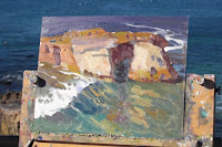


Ray's first demo of Day 1. (He did two that day.)


Don't ask me why but that really freed me up. I went out to do color studies -- not to paint a scene. Roberts uses a lot of information which he has learned over the years and which he credits to others - giving examples from the video monitor of Robert Moore's work who paints beautifully although he is color blind. As Ray Roberts said over and over... If you have the VALUES in correctly the colors don't matter. When dealing with color Ray said he learned from John Asaro at the Art Center in Pasadena that you need to analyse WHY a subject is the color it is. Is the color a reflection from the sky? .. from the water? .. from the rocks?... He likes to use warm colors and says that cool colors can be "deadly". (Something I totally agree with.)
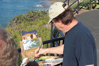
This workshop focused on painting rocks and water and much of his advice related to that theme. Although Ray would have preferred weather with "more atmosphere" to me, it was really beautiful. We spent the day painting rocks and the sea.... ABSOLUTELY GLORIOUS!!!

Some other advice:
Avoid equal shapes or colors or equal ANYTHING
Look for extremes in everything
Key Up (Make all values lighter)
Reds and yellows are "darker" than you think, so you need to be careful when using them
Look for the reflections (of rocks) in the face (not the white water) of the wave
Look for those little miracles of vision and light
Light reflects darker
Darks reflect lighter
Really dark color won't reflect at all
Look at other artists' work... look at zillions of photos... Read Edgar Payne's book
Squint
Keep most whites warm.... (Although he likes to use pure white as well)
Make CRISP edges on your dark rock shapes
Organize your shapes so that they are compositionally interesting
It's all about pattern
Foam (on the water) isn't quite as white as the sun glistening on the water
It's not the color you see... It's the way it relates to every other color in the painting
"2/3, 1/3, and a little bit" (A compositional tool to try out)
Drawing is critical and should be learned so well that you don't have to work at it
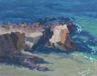
Here are my two 8" x 10" studies from day 1. Ray gave advice throughout the teaching sessions, which I tried to apply. (I was pleased that he thought my values were good as I was working.) I see however, from posting this here, that this first one could have been a LOT higher in value. .. oh well. There was a critique session at the end of the second day and I'll repeat his suggestions for these:

#1 (The Rock .. tide's going out) Make the white ripples less spotty on the right and lighten up the background ocean value a bit... otherwise good job.
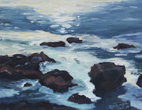
#2 (Sparkles)The two background rocks are too much the same. Change the value of both but change the shape of one. Otherwise successful.

It was a wonderful day in SoCal.

I walked about 4 miles back to the hotel, then rested up and cleaned up. Our daughter and her husband drove up from San Diego to meet Gastone, Tyler and I for dinner. I love being with my family!

Read Full Post


Topics

Archives