Blog


A Field Of White -- (Is it REALLY White?)


A Field of White
© Marian Fortunati
12"x12" Oil on RayMar Panel


Click on the link above for
additional details.


Arlington Gardens in the spring is always just a slice of heaven. 
Around each turn of the path is another breathtaking tableau.


When is white really white? 

I love painting the flowers from Arlington Gardens.  They are always so spectacular.  I painted this a while back and then "sat on it".  

Learning from many sources

I was just reading Robert Genn's recent post (HERE) which talks about the positive attribute of procrastination.  He called it "managing delay".  As I continue along on my painting journey, I am beginning to really internalize the value of letting paintings simmer.   I still have a very long way to go to develop the POSITIVES of this particular attribute.   Just yesterday during a thread of conversation with David Gallup in class, he talked about how he works on some of his paintings for months.  He'll paint a bit using layers of thick blended paint and let it dry enough to either scrape with a palette knife (sort of dry work) or sand off (VERY dry work).   He doesn't necessarily do this because he's painted a passage that he doesn't like, but because it is yet another way to develop the texture that one so enjoys in his work.   As the layers of paint come off, they leave different colors below which will show through the upper layers that he will lay in later.   Honestly I am a LONG way from that...   But one day I would love to have that as another tool to strengthen my work.

Are we ever "done"?  -- Should we be?

Right now I'm just talking about waiting a bit to see what needs to be tweaked, corrected or noodled before saying a particular piece is "done".   When I first painted these white irises, I painted them mostly white.  I liked what I had done.  I was happy with the dark/light notan of the piece and thought it read fairly well.   But then (again in David's class) I painted the abalone (click HERE).   I don't know why it hadn't dawned on me that white isn't really white.  I mean I KNEW that... but... sigh.


Anyway I went back and revisited this painting and tried to strengthen it by making the whites not really white.   I MAY have to procrastinate a bit more and revisit it again later, but for now...   here is "A Field Of White".

Read Full Post


Fading Light


Fading Light
© Marian Fortunati
12"x16" Oil On RayMar Panel


Click on the link above for
additional details.


It's about the light
It's always about the light, isn't it?   A few weeks back some friends and I were invited back up to a gorgeous meadow of wild irises high in the nearby mountains.   Despite the fact that most of the irises had faded and it wasn't as spectacular as it had been the previous year, it was still an amazing place.  We had an absolute ball painting there all day.

I managed to paint two and a half paintings while we were there all day but I am still not happy with any of them ... They are percolating in my mind and I MAY be able to rework one or two so that I like them better.  It was a late summer evening when we left and the light was gorgeous all the way down the mountain to the high desert area below.

Happy and exhausted
We drove down the mountain happily exhausted and stopped for a great Mexican food meal. (Alas, I was driving the group, so no Margaritas for Marian).   As we left, the sun was only catching the tops of the hills off in the distance.   It was stunning.  I was reminded that it IS always about the light.

I hope I caught the lovely mood of the last light of the day when I painted "Fading Light".

Read Full Post


Abalone And Radishes -- Inspiration and Challenge

Abalone And Radishes
© Marian Fortunati
9"x12" Oil on Canvas Panel


Click on the link above for
additional information.


Classes With David Gallup
I've been taking classes off and on from master artist, David Gallup.  Every time I'm there, I'm entranced with seeing his work in progress or being immersed in a stimulating conversation.  He currently has a terrific show at the Carnegie Museum in Oxnard titled, "David Gallup- Beneath the Surface: A Closer Look at Our Oceans"

It's a fairly long drive out to David's studio and especially when gas prices were so far up there, I often wondered WHY I go out there.   But invariably when I get there, I know why.

David is an artist who paints what he is passionate about.   He's full of information and full of life and enjoys sharing it all with friends and students.  I never know what we'll paint until I arrive.  Sometimes there is a model, sometimes we paint something he sets up.   There are often unique subjects for still lifes.  We once painted a Mako shark's head... (It was his birthday and one of his students thought it would make a great present to bring it to class as a subject to paint)..  It was.   This year for his birthday the class went to Catalina to paint.   I couldn't go and I'm sad that I missed it.

 
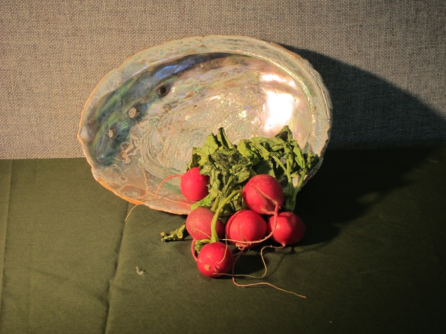
   The set up
 
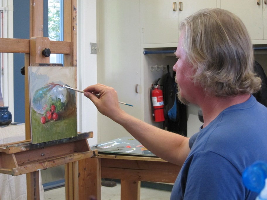
  David's demo


The Abalone Challenge
Last week he had set up an abalone with radishes.   He told us that in this class he wanted to focus on transitions.  (I thought that was serendipitous because my recent newsletter was titled "Transitions"!)  I have missed many classes this year because of one thing or another, so I hadn't painted the abalone yet.   Most of the other students had.  But David has said that he would want to paint it 100 times... just to learn how to paint it.  After discussing a few paintings that other students had brought in from a recent workshop that David led in Alaska, we got to work. 

I blocked in my 3 values in raw umber as David had taught me.   He suggested that the light value on the left side of the wall should be the same value as the inside of the abalone, which I hadn't really realized.   But I quickly fixed it and then started mixing my paints.  As David has demonstrated many times, I mixed up several piles of color with the same value -- some leaning green, some pinkish, some blue, some reddish, etc.   Then I started layering in the color.    I was feeling pretty good about what I was doing.   Most of us had a pretty good start and then David sat down to do a demo.   We all stopped to watch.   In about 45 minutes he completed a wonderful demo that it took all of us 3 hours to do.  

A few Davidisms:

Here are some of the "Davidisms" that I remembered to write down:

  • Where you find ambiguous areas, [in your painting] you need to embrace them. Use them as an opportunity for transitions. 
  • Don't impose your brain on the painting. 
  • We're only going to look at the lit side of an object to determine local color.  In the shadows you can play with color as long as the value is right.
  • Connect objects to their environment.  (Mixed colors of radishes and cloth and shell.)

I love learning.  I love listening to David explain painting, color and other work.   It was a terrific day.


By the way...   I have a little 6x6 painting on the Daily PaintWorks Auction.   Currently it's REALLY a steal!  Check it out before the auction closes (pretty soon).     Maybe you'd like this little gem called,

Read Full Post


Almost Famous --- Mystery Solved

The METRO proposal submission.

Gastone made me a "float" frame. -- Very cool!
My husband rocks!!


How I became "almost famous"
In late May I received a message on my answering machine which was followed up within a day with a formal letter announcing that I was one of three finalists for a Metro project. (Los Angeles County Metropolitan Transportation Authority (Metro).   It probably comes as a surprise, but Los Angeles -- the city of freeways and a gazillion cars -- DOES have a rail and bus system.  We even have some subways!

Panic!
I was in a panic!   First, I never realized that Metro hired "outside" artists to do anything.  I always assumed that the wonderful art in the subway stations was done "in house".   I kept thinking how did they choose ME???   I didn't even know such a program existed, nor did I apply for something this prestigeous.   Plus, I had never attempted to do a public art project.  

Well, after the panic subsided, I settled down and called the project manager back.   Each finalist was to submit a proposal for a poster (11" x 20" ... or 22x40) which would be used to create a bus and a rail Metro ticket highlighting the city of San Fernando.

Mystery supporter?
I thought that perhaps the director of La Galeria Gitana, Karen Nichols, had recommended me because the gallery is in San Fernando and she has been wonderfully supportive of my work.   But when I asked, she knew nothing about it.   I then thought that whoever recommended me followed my work on my newsletter.   But no one "admitted" it.    In the meantime, I worked on the submission.  I decided to include many of the features which make city of San Fernando unique.  I included the main entrances and two historical spots and two very modern locations.   I tried to tie the different vignettes together with a ribbon of swirling mariachi dresses.

Well, I finished the project  within the short timeline and I was proud of my submission, but mine was not the winning proposal.  

I will not be famous.   But I did have a good time developing the proposal.  And today I got a nice big fat check in the mail.  Almost famous is pretty nice.

The mystery is solved!
The project director called me today to let me know I could pick up my painting.   I asked him who it was that recommended me.   He explained that it wasn't someone I knew, but it was people in the art committee down at Metro.   They had seen my website (YAY, FASO!!) and evaluated the work in my portfolios to make the decision.  The committee narrowed down those that they were investigating to the final three.    I was very happy to be "almost famous."


So if ANYONE ever tells you that having a good website isn't important...   Well, you know what I think about that!!

Read Full Post


Canna Lilies In The Koi Pond

  Canna Lilies In The Koi Pond
© Marian Fortunati
10"x8" Oil on Linen Panel

  For additional details, click on
the link above.


     It was a nice day to paint with other artists from the "Thursdays En Plein Air" group.   I arrived at the grounds of the Brand Library (which I soon realized is a lot larger than I had remembered it.)   Several painters, including Chuck Kovacic, a wonderful painter and actor, were setting up to paint the classic views of the Moorish Library entrance.   It was beautiful, but architecture and I usually do not play well together.

     Another artist told me that there were more artists painting over by the Japanese Gardens just past the bathrooms.   Since I needed to use the facilities anyway, I walked over there to check out the scene.  It was beautiful too.   There I saw Lynne Fearman sketching an odd-looking duck who was posing quietly for her until some children came and chased the ducks away.  That woman can draw!!  WOW!

     Anyway, I decided to look at different kind of view so I sat among the canna lilies that lined the koi pond.   I had a pleasant morning painting and listening to the other artists paint.  I was enthralled by the dark reds of some of the leaves and the way that some of them mixed with green.  I loved the bright oranges of the canna flowers.   Anyway the contrasts of the darks and the brights is what attracted me to the cannas.

     A photographer from a Glendale newspaper came by and took my photo (as well as that of other artists and visitors).   I don't know if anything ever made it into the newspaper, but it was kind of fun to think about it.

     At lunchtime we grouped together and chatted.  Since no one was there to critique this week, we all just said a few words about our paintings while we finished up our lunch.

Read Full Post


Margaret's Irises


Margaret's Irises
© Marian Fortunati
11"x14" Oil on Linen Panel


Please click on the above
line for additional details.

A wonderful friend, advisor, curator and art expert, Margaret Danielak, (A Gallery Without Walls), posted a beautiful photo of the irises in her garden on Facebook last spring.   The image has stayed in my mind since then so I was really pleased when she gave me permission to use her photo as a reference for this painting.


I've enjoyed painting the irises and other flowers from Arlington Gardens in Pasadena and will probably do another several, but Margaret's irises were "just right", so I will include them in my "floral series".  

I really enjoyed painting this.   The colors and the notan captured my imagination and I was totally in to it as I painted.  I love it when that happens!!.   First I toned my canvas with raw umber then I wiped out the areas where I thought the light colors of the irises should be.   That is something I learned from David Gallup.   He doesn't draw out the scene first, but really just lets it flow from his imagination.   Of course he's a MUCH BETTER draftsman than I am, but I've found that when I try to paint this way, I'm not trapped into "painting within the lines".   It also helps me determine a notan pattern from the onset.  From there on, it was a matter of trying to find delightful colors within the value patterns and getting a bit of variety in my textures.

I was happy with the outcome.   I'm going to use this image on one of my postcards for my one-woman show coming up at the end of September!!!  (Yes... can you believe it??)


I'm sure I'll drone on and on about that show in the next few months, so please put it on your radar.  
I would LOVE it if each of you could make it.

Read Full Post


Topics

Archives