Blog


Liquid Amber Reflections -- Last Day of Kathleen Dunphy Workshop

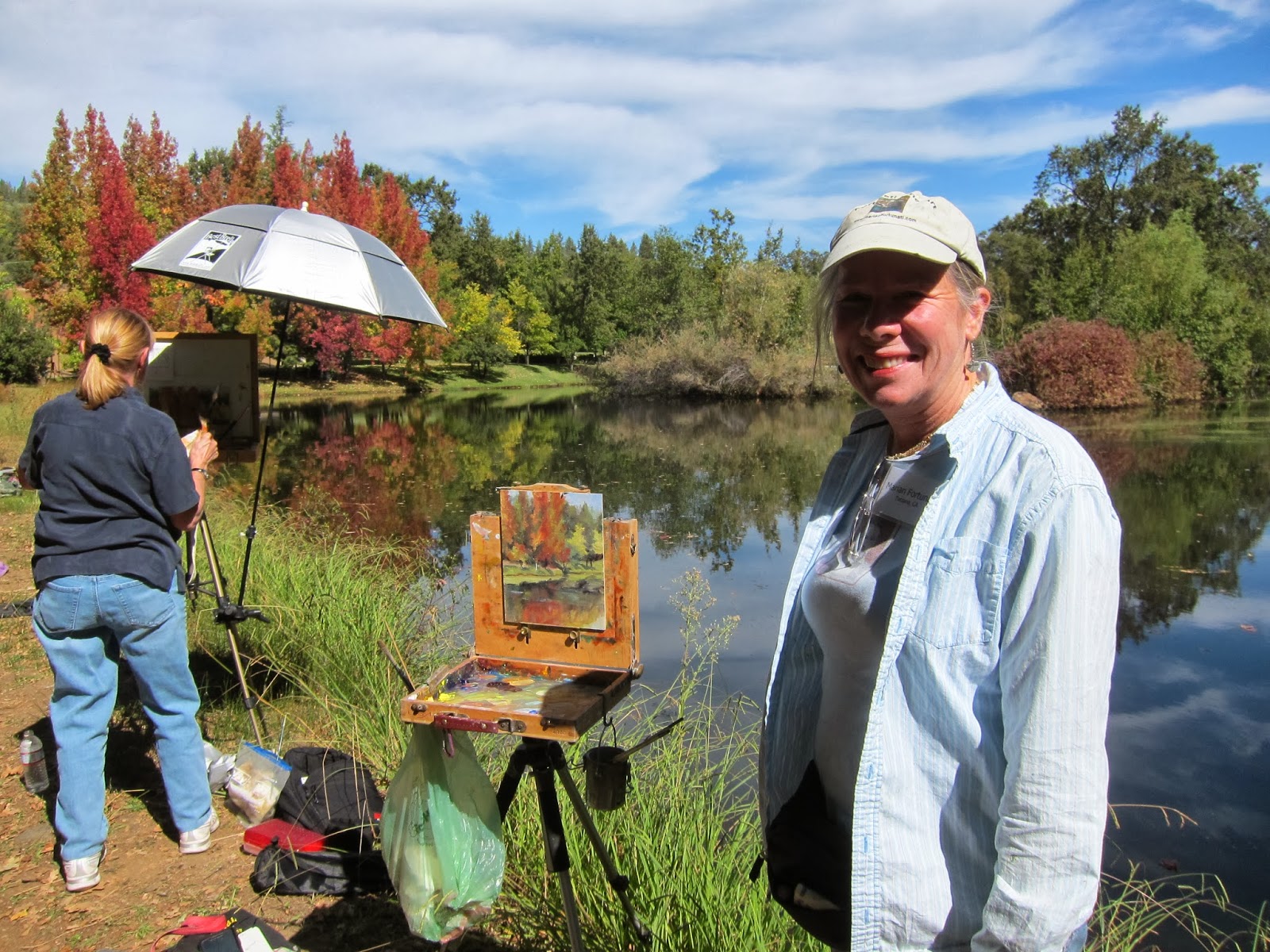
The day of the workshop continued to be awesome.  Kathleen Dunphy had so many great tidbits to remember.  On the third day we all met in the morning at Ironstone Vineyards.  This was quite a posh place with huge grounds and great rooms and places for parties as well as gorgeous reflecting lakes.

Here are some of Kathleen's suggestions:
  • Work against your tendencies in order to grow
  • Caste shadows will create a design rather than a form -- save them for last 
  • Before you start painting, you have to decide what will change first and get that down
  • Squint
  • It's better to start out loosely and tighten up later
  • Sneak up to the lights
  • Every cool has some warms
  • Sky holes are slightly darker than sky around it
  • Sky holes should have very soft edges
  • In general the light reflections on water are darker and the dark reflections are lighter

At Kathleen's house (wow!) she answered questions and led a discussion about the business of art
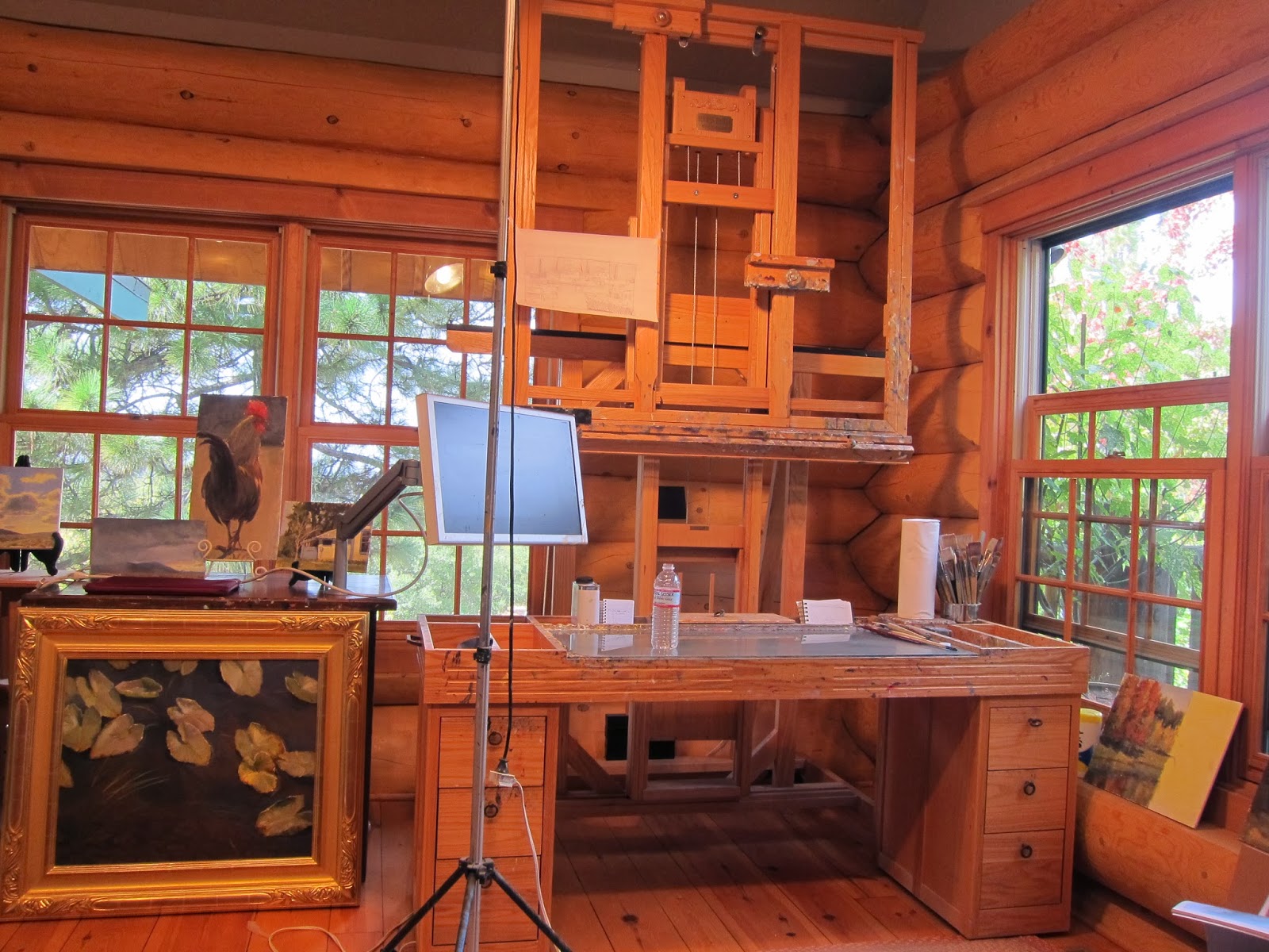
  • When setting up a studio consider the following
    • ventilation and circulations
    • north light is consistent ambient light
    • use warm incandescent light to balance the north light
    • have the longest square footage behind the easel so you can step back and look at your work from a distance
    • have a mirror behind you
    • work big
    • simplify
    • use big brushes
    • put a good frame on your paintings... it's like jewelry enhancing a nice outfit
    • participate with groups like CAC, OPA, AIS
    • constantly push yourself
    • work a weakness until it becomes your strength
    • always be professional
    • draw a lot
    • it's the half steps that make a painting
    • let the viewer fill in information with their minds...... don't do it for them

"Painting is a lifelong profession where frustration is your constant companion" - Dan McCaw.

Read Full Post


Twisted Oak Vineyard -- Lessons from Kathleen Dunphy

Kathleen Dunphy's workshop started out with several quotes which I really liked... 

"Art is long" 

"No one workshop or one teacher can do it all for you". 


Kathleen encouraged us all to keep an open mind as we move along on our art journey.   For me, that was the perfect way to start out.    It's not that I want to paint like her or any other artist I admire... but I'd love to paint as well and each artist I've studied with adds just a bit to the mix.  Kathleen is a superior teacher and I highly recommend studying with her.

I'll break up the last two days into two posts and list some of her thoughts as bullet points for any of you who may be interested.

  • I mentioned in a previous post that for me the most valuable lesson was her use of her "OCD" notebook.  I really needed something solid to use to better evaluate my own work and although I knew all of the elements, this habit is one I will try to make my own.
  • Direct observation is the first line of attack despite all of the "guidelines" we learn.
  • DESIGN
    • graphic symbol... most important element
    • does the thumbnail sketches to check format and design
    • less is more in design
    • use a focal path rather than a focal point
    • every mark you make is part of the design -- even the angles of skyholes in the trees
    • look at other artists like T. Allen Lawson or Dean Mitchell for good design
    • there should be a clearly defined light and dark pattern of overlapping shapes
    • get "simple" down first   --  can make it more complex later if you wish
  • VALUE
    • also a critical element
    • value helps you see form
    • squint... don't wear glasses... don't look for detail
    • white in shadows is DARKER than black in sunlight
    • there are many light sources outside
    • she mixes the lightest warm color she can to remind herself of the highest key on the piano she's playing
    • sneak up to the lights
    • depth is value
    • you can paint light areas more thickly because the ridges of the paint will catch more light and look sunnier
  • COLOR
    • she uses a limited palette (see previous post) to create beautiful harmonies
    • mud comes from dark paint into light paint mixed on the canvas
    • put the darks down first... pull any lights down on top
    • try to paint what will change fastest first (eg shadows)
    • don't ever wipe a painting in the field
    • observed and convey as truthfully as we can -- the goal is good information
    • there is no pure white in nature
    • keep your drawing skills honed...  practice with still lifes
    • every cool has some warm in it and every warm has some cools
  • EDGES
    • edges separate the "men from the boys"
    • sophistication in edges is essential
    • edges move the view through the painting
    • atmosphere is all about correct values
    • the eye seeks sharp edges then color intensity then design....
    • put your paint marks down "like you mean it"
    • edges are hard toward the origin of the shadow and softer toward the ends
    • shadow values warm up as it moves from the origin
  • PAINT QUALITY
    • build up slowly
    • add thicker paint where you want people to look
    • think about the abstract quality of the paint
    • thickly --- thinly -- scratched through -- all of this is eye candy .... the reward
  • EMOTION -- FEELING
    • it's why we paint
    • "Art is what happens between the viewer and the painting" - Tim Lawson
    • we artists have been given a gift -- we must honor the gift

She also suggested that in order to grow we must sometimes work against our own tendencies.   She uses a #10 bright brush (large) to avoid details.   Try it, try it, try it ... then paint it all out "like you mean it".

The painting above is my first painting of a vineyard.  It was painted in the afternoon of our second day.  We all had a grand time and enjoyed the day as we all tried to apply the many lessons Kathleen described.


"Twisted Oak Vineyard"

I'll describe the last day and some thought Kathleen shared about marketing when we visited her beautiful studio and home in my next blog post.

Read Full Post


The Italian Store --- Kathleen Dunphy Workshop

This is the second little painting I painted during Kathleen Dunphy's workshop.   I highly recommend Kathleen as a teacher, and artist and... heck, she's just a really nice and fun person to be around.  The workshop was offered up in Murphys, CA, near her home.  I really had no idea where that was -- just up north somewhere, but I'm glad I went.  Murphy's is in Northern California in the gold country.  It is an unspoiled little town that now does most of its business through the tourist trade who come because of all of the wine tasting and also because of the history of the area.

I went to the workshop alone.  I had tried to get my husband to go up with me.  I figured he could fish while I was painting.  But he couldn't make it.  So I drove up alone.  It took over 7 hours by car and it was pretty miserable on the way up because the winds along the 5 were blowing dirt across the highway.  Between the low visibility and the many trucks, I was happy to turn off the 5 and cut across to the 99. 

I finally arrived, took a walk around town and then met my fellow workshop takers at a dinner Kathleen had arranged at a local Mexican restaurant.  I could tell already it was going to be a good workshop because she set the stage for learning and being comfortable.

We met the next morning a bit out of town at an old historical school house which is used as a community center in Murphys Flats.  All morning Kathleen talked about her approach, her color palette, and plein air painting in general.  She demonstrated mixing colors with her limited palette.  Many years earlier I had learned to appreciate the use of a limited palette when I took a few classes in Mexico from Frank Gardner.   Frank's palette uses cad yellow, lemon yellow, cad red, alizarin, ultramarine blue, thalo blue and white.  It is very versatile and I used it for many years before expanding my palette when I began to study with David Gallup.

Murphys Flats Schoolhouse study by Marian Fortunati

Kathleen sent us a list which was very specific about colors and brands.  She used Utrecht and Rembrandt colors.  She asked us to bring Naples Yellow Deep (U), Lemon Yellow (U), Ultramarine Blue (R), Cold Grey (R), Permanent Red Medium (R) and white.   Although I'm pretty good with color mixing, this was a bit different and it took me a while to manage.  She feels that by using this palette one can avoid the MUD that many people end up with when mixing.  I enjoyed trying it and will definitely add Cold Grey to my repertoire but feel that I can avoid the mud and mix colors well enough without this limited palette.

Murphys Flats Schoolhouse study

I totally enjoyed the morning lessons and, although I found the area around the school house somewhat uninspiring, I did paint a little view of the schoolhouse in the afternoon.  Kathleen went around assisting each of us a couple of times each giving thoughtful advice and encouragement.

The next morning after a brief recap we went out on the street where we were invited to watch her demo or paint alongside or paint somewhere else.   I watched.   Then I tried to paint but ran out of time so only got the sketch, the block in and part of the painting finished before lunch.   I finished the painting at home.

"The Italian Store"


I also photographed the historical info about the store which has had many uses over the years

but now is part of a property that is a bed and breakfast.

I'll post some of my notes in my blog about the afternoon and last day of our workshop.   Bye for now.

Read Full Post


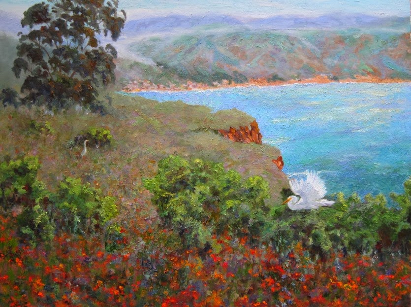
My View From The "Throne"

Contemplation from the "throne"


Just before I left for my three day workshop with Kathleen Dunphy up in Murphys, California, I pretty much "finished up" my "large" painting.  Now I'm back.. and, of course, I realize I'm not finished at all.

A few things have happened which caused this change of heart.  

We all know that stepping back from a painting is critical during the time you work on a piece.  A happy accident of how I arranged my work area is that the easel I use is directly in line with the toilet.  Not only can I stand back to look between applying paint, but I can contemplate the painting during potty breaks.  (LOL)

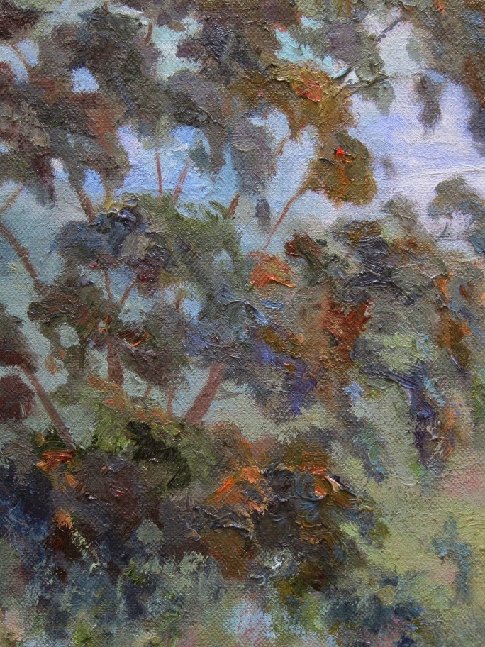
Of course, getting away from the artwork that you spend so much time in front of is something I've learned over the years is really important to seeing "better".   Some people turn their paintings to the wall for a while or put them in another room.  I need to be more disciplined about doing this each time.  I also think that the need to get away is amplified with larger paintings.  This is the biggest painting I've ever done -- It's 30x40.  David Gallup, my mentor, challenged all of his Master Class students to create larger paintings.  (Actually to him, this isn't really large..... but to me it is huge.)  I've been working on this painting ever since I did the plein air study called "Delight" last spring when I was painting with Kay Zetlmaier.  It sold right away, but the collector who purchased it told me I could keep the plein air piece until I had finished my large piece.   (I don't think he realized it would be THIS long, however.)


Once you've been away from the work for a while you can begin to better assess what needs to be done.  During the workshop with Kathleen, she shared what I think is a superb way to analyze your own work.  She called it her OCD notebook because after every painting reaches a certain "finished" stage, she takes out her notebook and formally analyzes how she can make it better.  (And then she applies what she was thinking.)  Although she uses her own shorthand, these are the elements she reviews with EACH PAINTING she creates.
DESIGN
VALUES
COLOR
EDGES
PAINT QUALITY
FEEL


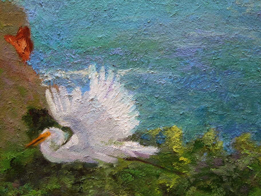
When I used her "OCD method" with this painting, I really saw some things that need continued work.   I like the design.  It's not symmetrical, I think I avoided repeated shapes and I think the eye travels nicely through the painting.   I think the values are good but might need a little tweaking to make the far ground recede even more.  However, the color is way off in the water -- I'll need to rework that whole area.  This is frustrating, because I have repainted this section many times already... I WILL get it so I like it... really I will!   I like what I've done with my edges although I may try to work on the foreground egret a bit more to see where some of those edges can blend into the background.... maybe.   I like the paint quality -- I worked very hard to build up layer after layer and to avoid having repeated brush marks, etc.  I also think there are some more restful areas of paint, to balance the work.  Generally, I like the feel of the painting and think it will be even better after I make some of the changes mentioned above.

Any thoughts??

Read Full Post


Topics

Archives